

.svg)
Every visitor who lands on your website makes a decision before they read a sentence. Research from Carleton University, later confirmed by Google, found that people form a visual opinion about a website in as little as 50 milliseconds. That's not reading time. That's a gut reaction based entirely on what the page looks and feels like before a single thought fires.
The hero section — the area visible above the fold before anyone scrolls — is where that decision gets made. Get it right and the rest of your page has a chance. Get it wrong and visitors are already mentally halfway out the door.
Most established UK service businesses get it wrong. They built websites with the wrong goal in mind.
The hero section has one job
It's not to impress people. It's not to explain everything your business does. It's not to win a design award.
The hero section's job is to answer three questions fast:
- What does this business do?
- Is this relevant to me?
- Do they look like the kind of business I'd trust with this?
That third question is where most business owners stop thinking. They get the first one or two — usually — and assume the rest takes care of itself. It doesn't.
The two things your hero communicates (and only one of them uses words)
Your hero section works in two languages at once.
The first is the written message: your headline, subheadline, and any other copy above the fold. That handles questions one and two.
The second is the visual message: the image you've chosen, the design quality, the colour palette, the font weight, how polished or rough the whole thing looks. That handles question three, and it does so in those first 50 milliseconds, before anyone has read a word.
The two messages need to match. When they don't, visitors feel something is off, even if they can't say why.
A Hampshire accountancy firm I looked at recently had a... reasonable attempt at their hero section.
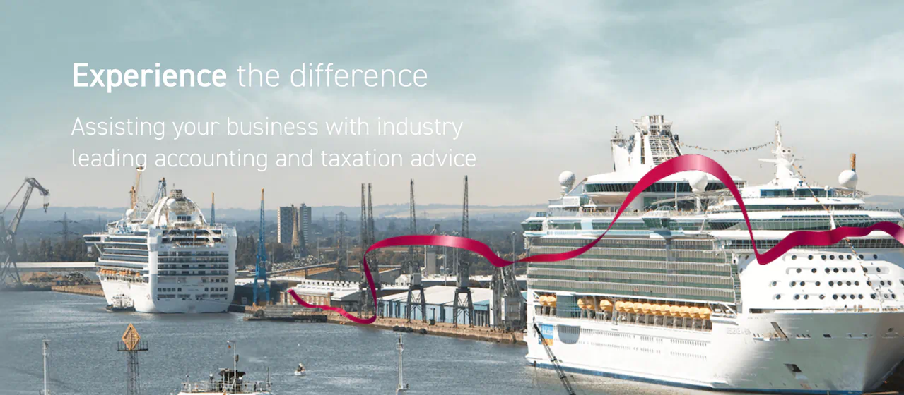
You could just about tell it was an accounting firm. Decent enough start.
The hero ran a rotating slideshow of three images: Southampton docks, a moody pier, and Portsmouth harbour with the Spinnaker Tower.
Beautiful photography. No connection whatsoever to accounting, to the business, or to anything a prospective client would find reassuring. The written message said "established, professional accountants." The visual message said "we work in the maritime industry", or simply "we had some pretty pictures of Hampshire so figured we'd use those". The page felt cheaper than the business deserved.
The hero headline itself read: "Experience the difference."
Three words that say nothing. No indication of who they help, what they do, or what difference they're even referring to. A visitor arriving cold, someone who found them through a search and has no existing context, is no better informed after reading that than before.
What the written message needs to do
The headline is the most valuable copy on your website. It gets read before anything else, and on a service business homepage it needs to do real work.
A good hero headline answers: what do you do, and who do you do it for?
"Chartered accountants for Hampshire businesses" is better than "Experience the difference." It's not elegant, but it's clear, and clear beats clever every time on a service business homepage.
Better still: use the images to your advantage. If that firm does specialise in maritime businesses, those harbour photos could work. But then the headline needs to say so. "Chartered accountants for Hampshire's maritime industry" tells the right visitor immediately that they're in the right place — and tells everyone else just as quickly that they probably aren't, which is equally valuable.
Right now the images hint at a specialism the headline doesn't mention and the rest of the site doesn't confirm. The visual message and the written message are pulling in different directions, and the visitor is left to figure out which one to believe.
The subheadline then has one job: add the detail that earns the scroll. Geography, client type, specific outcome or differentiator. One or two sentences.
A lot of hero sections fail here because they try to do everything in the headline. Three services, two locations, and a founding year crammed into a sentence that's technically accurate and completely unreadable. The headline earns attention. The subheadline earns the scroll. The page earns the enquiry. These are different jobs.
What the visual message communicates
Before anyone reads a word, they've already decided whether your business looks like it fits them.
Think about what you're communicating with image choice. A posed stock photo of a model in a suit signals "generic." Real photos of your team, your office, or work you've done signal "actual business." An irrelevant full-screen photograph of a Hampshire skyline with your logo over it says "I had no idea what image to use here."
Beyond image choice, the design language of your hero section communicates something about the kind of business you are.
Premium vs accessible. High contrast, generous white space, a restrained colour palette and clean typography signal an expensive, considered service. Busy layouts, multiple bright colours and relaxed copy signal affordable and approachable. Neither is wrong — but the signal needs to match who you're trying to attract. A commercial solicitor whose fees start at £500 an hour needs to look the part. A local builder who prides themselves on being down to earth probably shouldn't look like a law firm.
B2B vs B2C. Service businesses often use imagery that feels consumer-facing: lifestyle photos, emotional scenes, aspirational settings. Your client is a business owner or decision-maker sitting at a desk. The visual tone that resonates with them tends to be more direct and more focused on outcomes than on lifestyle.
Professional vs approachable. This is a spectrum, not a binary. The mistake is ending up in the middle by accident, not polished enough to feel premium, not warm enough to feel friendly. Pick a direction and commit to it. Anything in between tends to read as "couldn't decide."
None of this is complicated in principle. It becomes complicated when a designer worked to a brief that said "make it look professional" with no thought given to who "professional" is supposed to signal to, or what kind of client that signal is meant to attract.
The components of a hero section that does its job
Across every site I audit, the hero sections that work have the same structure:
- A headline that says what you do and who for. Specific, not clever. The business name alone doesn't count as a value proposition. If you're struggling to come up with the perfect headline for your business website, take a look at our article here.
- A subheadline that earns the scroll. Adds specificity: geography, client type, the outcome or differentiator that matters. One or two sentences.
- An image that supports the message. Shows the business, the team, or the work, not a stock photo the visitor has already seen on three other sites this week. If stock is unavoidable, choose something specific to your sector rather than generic "professional people" imagery.
- A single clear CTA. One action. Not three options competing for attention in the same section. One next step, with a label specific enough that the visitor knows what happens when they click it.
- Visual language that matches the client you're trying to attract. If your best clients are MDs running businesses with serious turnover, the hero needs to look like a business that works with MDs running businesses with serious turnover.
Where it tends to go wrong
The most common failure isn't one bad element in isolation. It's a mismatch between what the business has achieved and what the website communicates.
I look at sites for businesses that have been trading 15 or 20 years, genuine relationships, real results, actual credibility built over decades. Their hero section looks like it was built for a company that launched six months ago and isn't quite sure of itself yet.
The headline hedges. The image is generic. The CTA says "Get in touch" with no indication of what happens next, and the whole thing comes off as unsure, when the business could speak with some confidence.
Your hero section should reflect where your business is now, not where it was when the website was last built. If the business has grown, the website needs to catch up.
If you want to know what your hero section is actually communicating, in both the written and visual message, a website audit will tell you. I'll go through what visitors see in those first few seconds and what it signals about your business.


.svg)